Meytal Dahan
Back to insights

Cracking a Conservative Market: How Does Modern Product Design Open Up the LegalTech Market?
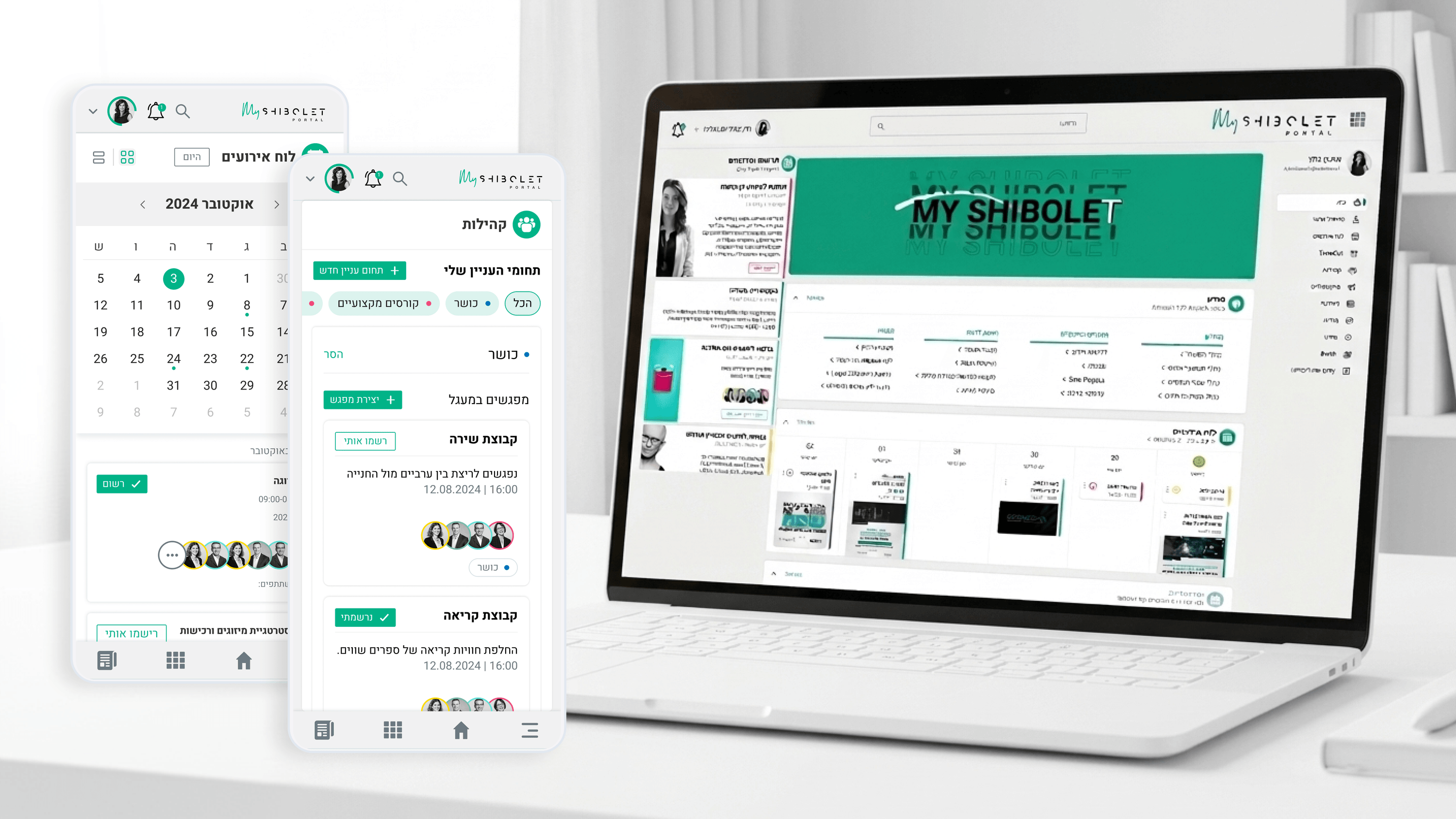
Shibolet & Co. — Designed the firm's internal community hub - balancing the gravitas of a top legal practice with a social tone inviting enough that employees would actually use it - into a space precise enough to belong inside the firm and warm enough to feel lived-in.
The legal technology market (LegalTech) has traditionally been considered one of the most conservative and hardest markets to penetrate. Attorneys — and especially senior partners at leading firms — are wary of new technologies and fear breaches of confidentiality, digital human error, and loss of control. Founders trying to crack this market run into an especially high wall — not because their product isn't good, but because it's designed in a visual language that's foreign to this audience. Working on the Shibolet & Co. platform, one of the central insights was that attorneys need to see professionalism before they start falling in love with the experience. The design language combines elements that convey stability, authority, and trust — serious typography, generous spacing, precise microcopy, and a professional communication tone — alongside modernity and efficiency in the tools themselves. The platform's success came precisely because it didn't try to "be startup-y" but rather to "be a digital legal partner." Founders in LegalTech who want to crack the market have to understand: this isn't an app for Gen Z. The product design has to reflect the culture and values of the audience you're addressing. Conservative yet modern, human yet professional, efficient yet measured — that's the combination that will open up the most conservative market in the economy for you.

Get in touch

Have a project in mind?

Drop a line. Meytalyav@gmail.com

Related articles

Shibolet & Co.
Engineering LeadersProject-Specific Data Visualization

Visualizing a Community, Not a Dashboard

Say data visualization to engineers and they picture analytics dashboards. Shibolet's internal community hub needed the opposite. It was a community hub for a law firm, not an admin reporting tool. The job was making events, courses, benefits, and interest groups scannable and inviting, with light cues like who's attending or active. No charting engine, no KPI grid. Project-specific data viz means the representation answers this domain's real question. Here it was always: what's happening in my community, and what's for me?

Read
Shibolet & Co.
Project Managers

Running a Digital Project in a Legal Organization: How Do You Hit Deadlines When Partners' Time Is Worth Gold?

Project Managers in legal organizations — your biggest pain point is the billable hours of your partners. On the Shibolet & Co. project we developed a "Batched Approvals" method paired with Figma prototypes: every decision is presented with 3 clear alternatives, and a partner can sign off in 15 minutes instead of an hour. That's how you protect the Gantt and the budget.

Read
Shibolet & Co.
Product ManagersTypography & Visual Hierarchy

Typography as Triage: Ordering a Legal Community Hub

PMs keep asking: how do users know what matters when one screen does five jobs? On Shibolet's internal hub, a single view carried a compliance notice, a new course, a firm event, and a community invite. I didn't solve that with more tabs. I solved it with typography. A deliberate type ramp let official items read with authority and social content stay warm, in the same layout. Visual hierarchy is product triage made visible. Get the type ramp right and you stop negotiating screen real estate per stakeholder.

Read
Meytal Dahan

About

Making complicated into easy for users.

Senior product designer with a decade of work across complex systems - financial risk platforms, legal operations, healthcare apps, manufacturing tooling and insurance portals. The common thread is depth: products where the data is rich, the users are expert, and the interface has to disappear into the work.
