
The Color of Trust and Belonging at a Law Firm
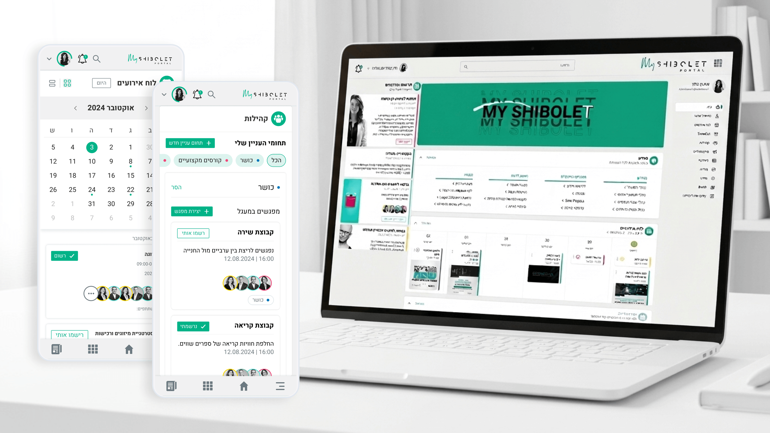
Founders think about brand as a feeling, so this one should resonate. Shibolet & Co. is one of Israel's leading law firms, and its internal community hub had to feel like that the second an employee logged in. But it also had to invite people in, not just impress them. The previous internal site was minimal and purely functional, the kind of place you visit only when forced. We wanted somewhere people chose to be. Color carried a real share of that emotional load. I anchored the palette in tones that signal credibility and institutional steadiness, the visual equivalent of a firm you trust with serious matters. Then I introduced warmer accents to mark the social layer, the events, the interest-based connections, the community moments, so belonging felt designed in rather than bolted on. The discipline was restraint. Too much warmth and the firm looks unserious; too little and the hub feels like the old notice board nobody opened. Color psychology here wasn't theory, it was the lever that let a serious institution feel human. For a founder, that is exactly the brand bet: trusted and wanted at the same time.
Related articles

About
Making complicated into easy for users.
Senior product designer with a decade of work across complex systems - financial risk platforms, legal operations, healthcare apps, manufacturing tooling and insurance portals. The common thread is depth: products where the data is rich, the users are expert, and the interface has to disappear into the work.