
The First Login Problem at Shibolet
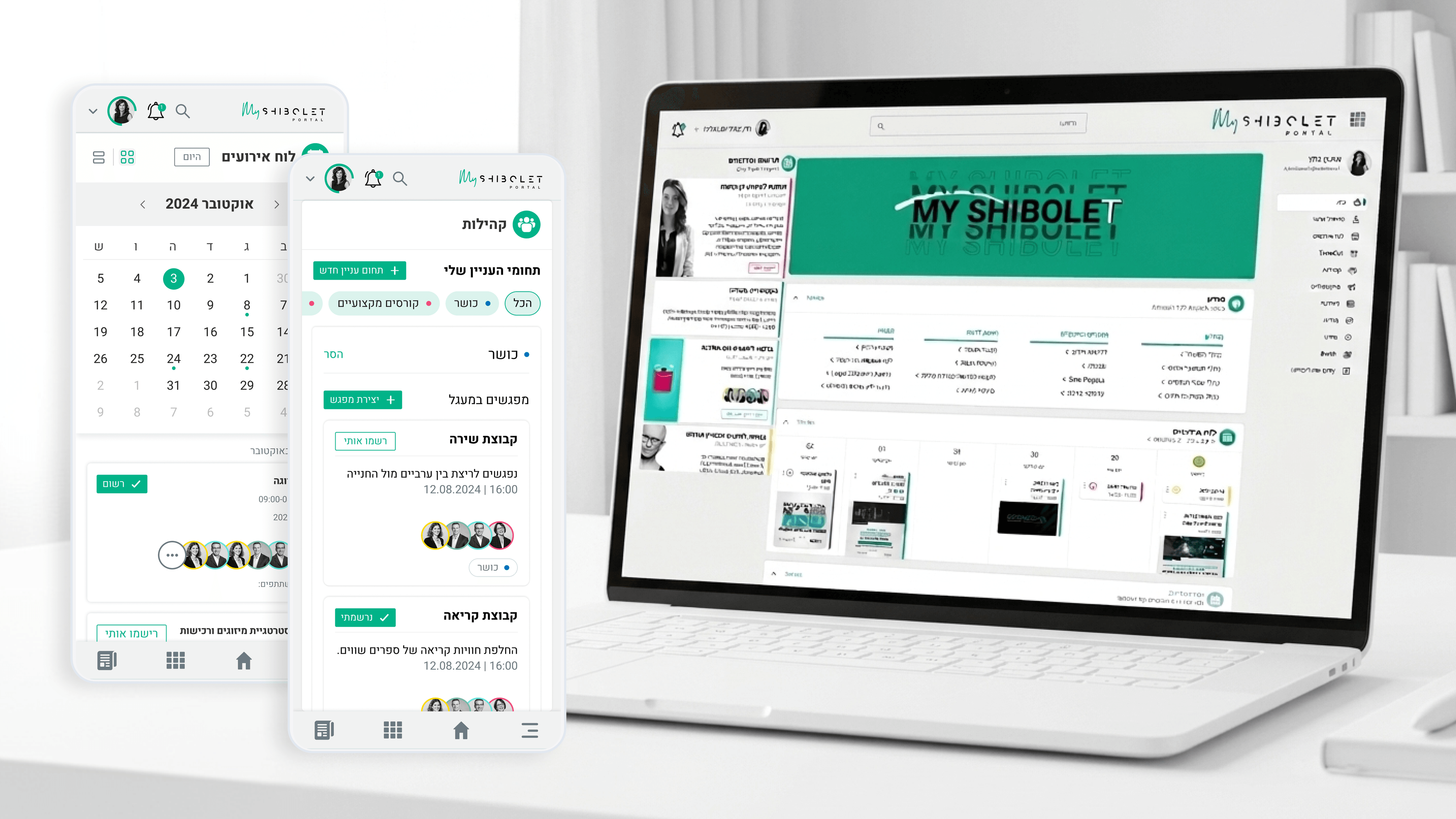
The riskiest screen in the whole Shibolet project was the one an employee saw on their very first login. The platform we were replacing was a minimal internal site, basically benefits info and course notices, the kind of thing people opened only when they had to. Now we were asking those same employees to treat the hub as a community, somewhere they'd return to for events and interest-based connections. First-run onboarding was where that expectation got set or lost. For a PM, this is the activation moment, and I designed it as one. The first experience had to communicate two things fast: this is your firm, serious and credible, and this is also for you, social and welcoming. So onboarding gently surfaced the social layer alongside the familiar functional content, signaling that events and connections belonged here too, not just the notices people already expected. The line I walked was warmth without overwhelm. Too much hand-holding insults senior legal professionals; too little and people fall back to old habits and never discover the community features. Onboarding wasn't a tutorial overlay, it was the firm's first impression of a new way of working, and getting that first run right was what gave every later flow a chance to matter.
Related articles

About
Making complicated into easy for users.
Senior product designer with a decade of work across complex systems - financial risk platforms, legal operations, healthcare apps, manufacturing tooling and insurance portals. The common thread is depth: products where the data is rich, the users are expert, and the interface has to disappear into the work.