
The Notice Board Was Our MVP
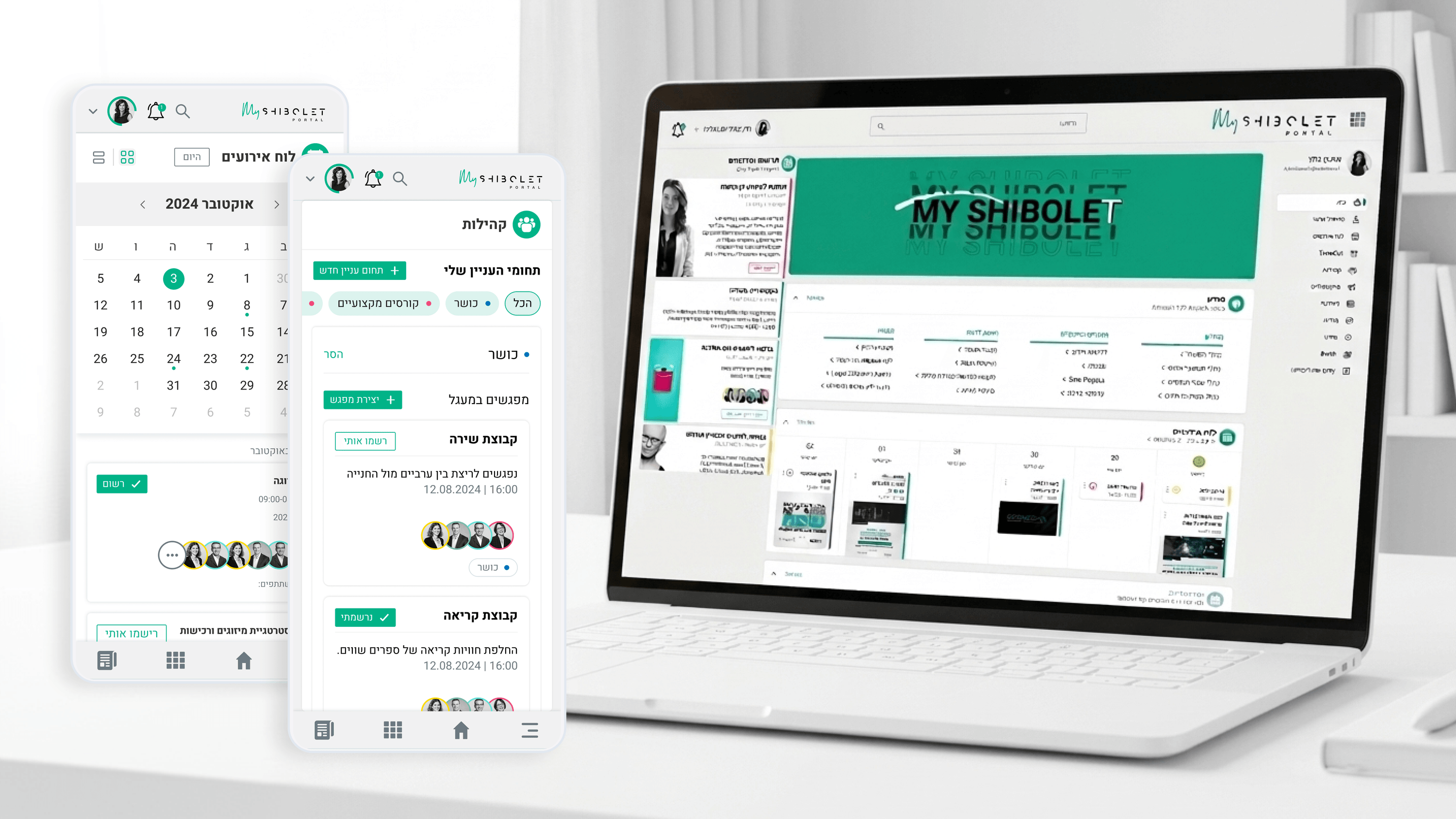
Founders love the clean-slate build, but Shibolet & Co. taught me the more honest version: the MVP already existed, and it was unloved. The previous internal site — benefits information, course notices — was effectively a minimum product that proved one thing only, that people would tolerate a place to look things up. My job over roughly four months and around ten user flows wasn't to add features onto that; it was to grow it into a full version with a different reason to exist. The leap from MVP to full product is rarely about volume. It's about ambition of purpose. The notice board answered 'where do I find policy?' The full hub answered 'how do I feel part of this firm?' — folding events, interest-based connections, and community activities in alongside the practical content. The discipline was resisting feature sprawl while making that bigger promise real. I kept the dependable utility employees already trusted and built warmth around it, rather than replacing one with the other. For founders, that's the lesson: your MVP often validated survival, not the vision. The full version is where you finally say what the product is for.
Related articles

About
Making complicated into easy for users.
Senior product designer with a decade of work across complex systems - financial risk platforms, legal operations, healthcare apps, manufacturing tooling and insurance portals. The common thread is depth: products where the data is rich, the users are expert, and the interface has to disappear into the work.