
Small Motions, Serious Hub: Animation Without the Fluff
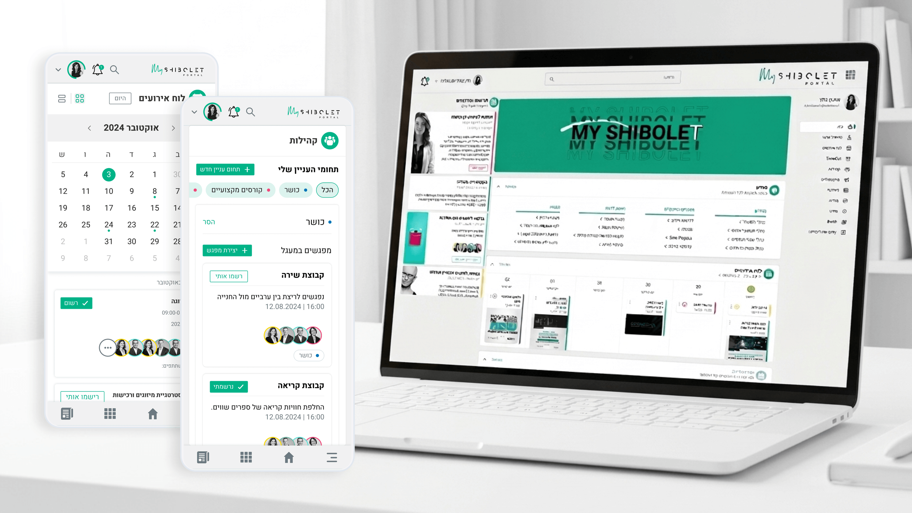
There's a reflex in product reviews to treat micro-interactions as polish you cut when timelines tighten. On Shibolet's internal community hub I'd push back, because here motion did a job. The platform had to balance the gravitas of a leading law firm with a social tone warm enough that employees actually used it, and animation was one of the few tools that could speak to both at once. The principle I held to was restraint with purpose. Subtle transitions confirmed that an event RSVP registered or that joining an interest group worked, giving feedback without theatrics. Motion guided attention between the serious content and the social layer instead of decorating it. What I deliberately avoided was bouncy, playful animation that would have undercut the firm's seriousness, and dead, instant state changes that would have made the hub feel as lifeless as the old internal site. For a PM, the framing is feedback and confidence, not delight for its own sake. Every micro-interaction earned its place by reducing uncertainty about whether an action worked. That's the test I'd bring to any prioritization conversation: does this motion lower doubt, or just add seconds and risk to the build?
Related articles

About
Making complicated into easy for users.
Senior product designer with a decade of work across complex systems - financial risk platforms, legal operations, healthcare apps, manufacturing tooling and insurance portals. The common thread is depth: products where the data is rich, the users are expert, and the interface has to disappear into the work.